Using a web page instead of a landing page for an ad campaign is one of the most common mistakes in a Google Ads campaign. Wondering whether you’ve made the same mistake in your Google Ads campaign? You can check your analytics dashboard for signs to use a landing page for Google Ads.
Indicators such as poor conversion rates, low ROI, and high bounce rates make it clear that your campaign needs a dedicated landing page.
This article includes a comprehensive Google Ads landing page checklist to help you avoid this mistake in the future.
Difference Between a Web Page & Google Ads Landing Page?
A web page built using HTML, CSS, and JavaScript helps businesses showcase their products or services. Its header and footer indirectly link to other web pages for easy navigation. However, a landing page built for Google Ads with the same technologies targets a specific audience group focusing on converting visitors into leads and avoids navigation by all means.
Businesses wanting a digital presence build websites and put a lot of effort into reaching their audience organically. They also strategically want to boost lead generation using ads.
You want the web pages to be indexed on search engines (say, Google), however, you avoid the same for Google Ads landing pages because they address only one target group and need to be fine-tuned whenever required.
So, understanding the landing page’s purpose and goal before launching the campaign helps avoid costly mistakes and improves the landing page’s experience.
9 Elements To Check In A Google Ads Landing Page
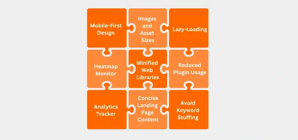
1. Mobile-First Design
Right from the wireframing stage, ensure you adopt the mobile-first design philosophy for the landing page. This decision simplifies complexities like ensuring responsiveness across devices, fixing the length of copies for each subheading within a section so it doesn’t affect the design consistency, and more.
2. Images and Asset Sizes
Don’t rely too much on stock images if they don’t convey anything or make a difference. Also, heavier logos, icons, and image files make your landing page bulky. As a result, it takes more time to load the page and today’s audience is highly impatient.
According to Neil Patel,
- 47% of consumers expect a web page to load in 2 seconds or less.
- 40% of people abandon a website that takes more than 3 seconds to load.
- A 1-second delay in page response can result in a 7% reduction in conversions.
Therefore, it is important to keep a check on the assets’ size you use while building a landing page.
3. Lazy-Loading
A heavy landing page with bulky images will take forever to load. You don’t want that for your landing page as every second is precious. Implement lazy-loading practices to prioritize the texts and assets in the viewport to load faster and all the other assets take the back seat.
Some of the metrics to monitor are: Largest Contentful Paint (LCP), First Input Delay (FID), Cumulative Layout Shift (CLS), Total Blocking Time (TBT), Time to First Byte (TTFB). These metrics affect the overall experience of your landing page.
You also get tips and tricks to improve them for both desktop and mobile devices if you explore the Page Speed Insights web app by Google.
4. Heatmap Monitor
A heatmap monitor shows you the user behavior on your landing page. It highlights the regions where the visitors spend most of their time, clicks, how far they have scrolled through the landing page, and more.
These insights aid in optimizing the CTA button text, layouts, unresponsive forms, click-event malfunctions, and the content flow to direct the visitors to take action.
5. Analytics Tracker
Using a centralized tag manager like Google Tag Manager (GTM) simplifies managing tracking codes on your website. You can implement analytics tools like Google Analytics 4 and behavior analytics tools like Mouseflow through GTM and update them periodically as and when needed.
The analytics tool gives you insights on click-through rates (CTR), conversions, and user flow to understand what’s working and what’s not. Also, make sure that no other scripts on your landing page have conflicts with the analytics tool’s script to avoid conflicts.
Some benefits of using Google Tag Manager
- Fast deployment of tracking codes
- All tags are managed in one place
- Testing tools
- Reusable container templates (recipes)
- Simple event tracking
- Tag templates
- Versions, workspaces, and environments
6. Minified Web Libraries
There are a lot of frameworks and libraries like Bootstrap, jQuery, React.js, Angular.js, Vue.js, etc. for the web technologies CSS and JavaScript. These frameworks come in two different versions and sizes.
One is a full version which is bulky and the other is a minified version which is light-weight. It is a best practice to use the minified version for the Google Ads landing page. This way it doesn’t take much longer to load the landing page and improves the user experience.
7. Reduced Plugin Usage
When you have customer reviews on other platforms such as Clutch, ProductHunt, G2, TrustPilot, etc. you can sync your landing page and those ratings in real-time. This synchronization helps you display your customer ratings, making for great social proof.
While this can sound beneficial, it requires you to use web plugin scripts making the landing page even bulkier. Instead, you can design the content during the wireframing stage and use web technologies such as HTML and CSS to display social proof.
8. Concise Landing Page Content
While consistency is important in both design and content, the character and word count range under each subheading matters. Subheadings from one section can have a different word count range than the subheadings from another section.
These constraints depend on the UI design. And they help improve the landing page from an aesthetic standpoint. Now the task is to communicate the content well within that constraint.
As the constraint supports the content to be concise, you may, at times, want to tweak the constraints slightly to accommodate the messaging/content. Discuss the same with the UI designer and ensure changes to these constraints are uniform within the section and subheadings.
- An example of a consistent word count range
- An example of an inconsistent word count range
9. Avoid Keyword Stuffing
If you’ve been producing SEO-focused content, stuffing keywords becomes second nature. Avoid doing that consciously. Of course, keywords are essential to establish relevance even in Google Ads landing pages. But when you start stuffing them, it becomes an overkill.
Keep the keyword usage as natural as possible and focus on narrating a story about their pain points, how it affects their daily life, and what your solution can do for them. This flow will force them to engage in a conversation with you.
Bonus: Use Robots.txt Efficiently
Do not forget to mark the landing page’s slug for Disallow on the robots.txt file. These action items help prevent Google from crawling your landing page and ranking it for SEO traffic. This is an important step because once the organic traffic starts flowing into the page, then it would give you a hard time tracking the paid traffic.
Example:
User-agent: *
Disallow: /example-landing-page-slug/
The command “User-agent: *” addresses all the bots.
The command “Disallow: /example-landing-page-slug/” instructs the bot to not crawl the specified page.
Ideal Landing Page Examples
The below ad results popped up when I googled “Mouseflow alternatives”.
1. VWO
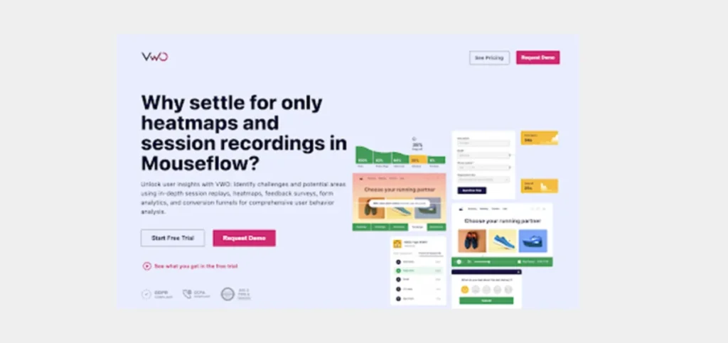
The first section explains the additional values the product delivers and how it enables them to tackle their day-to-day challenges. The illustration beside the content also emphasizes the same so the audience gets a sneak peek of how the product will look once they start using it.
If the visitor is skeptical about making a decision, the first section is followed by a sleek ribbon showcasing the social proof. This ribbon helps build trust and makes them read further to know what’s in it for them.
The second section elaborates on the benefits the visitors would reap when they start using the product. This section might address all of their requirements and go a step further and surprise them with solutions that they never even imagined.
The third section is strategically designed to appeal to marketers by addressing pain points like customer drop-offs and conversion optimization. Using relatable scenarios (e.g., “38% drop-off at checkout”) ensures that the audience connects with the problem being solved.
The image beside the content provides concrete numbers, such as “100% → 82% → 64% → 26% → 8%,” which adds credibility. Showing tangible data positions VWO as a solution grounded in measurable results, appealing to decision-makers who prioritize ROI.
It also embodies value-driven messaging. Each feature—such as visualizing customer journeys, monitoring conversion rates, and analyzing drop-offs—is framed around delivering business outcomes rather than just showcasing product capabilities. This kind of messaging flow helps potential customers see how VWO can directly impact their KPIs, such as revenue growth or lead generation.
Likewise, the content in each section appeals to the visitors and drives them towards taking action. You can also check the consistency in design and word count throughout the landing page contributing to the aesthetics.
And there is no scope for navigation on this landing page. The visitor has to either submit their details by clicking on the CTA buttons or quit the page. VWO didn’t give the room for visitors to get distracted and stray away from the landing page.
2. Uptrends
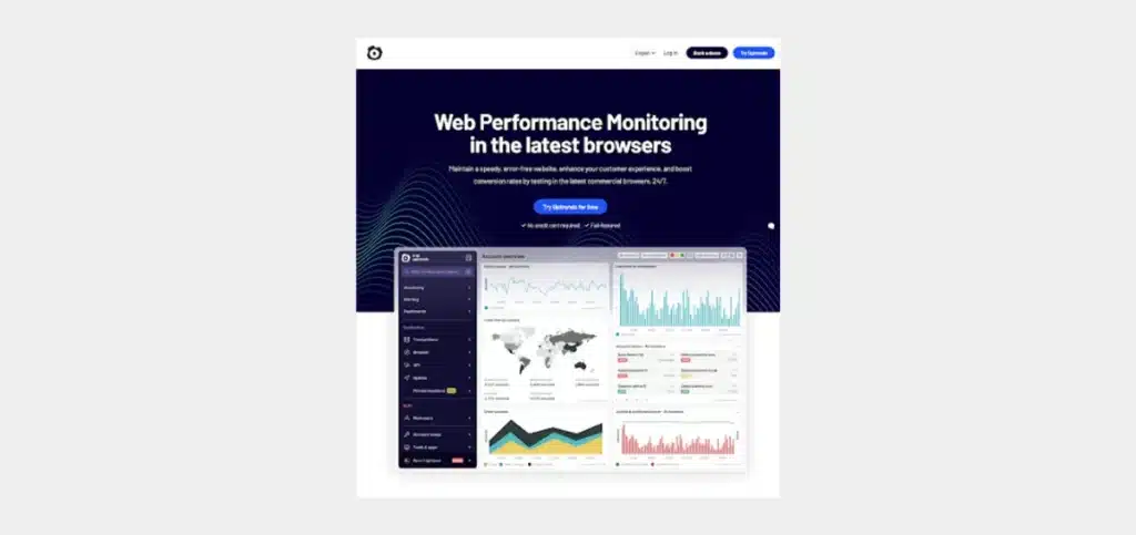
This landing page stands out well in terms of objection handling. The content just below the CTA in the first section addresses the possible objections visitors might have and irons them out. Just like the previous landing page, it also has a ribbon featuring its customers to build trust among its visitors.
The content has been thoroughly researched and well thought-through in the later section too. When Conversion Rate Optimization (CRO) specialists visit this page, it talks about their business problems such as making sense of web performance data, fixing errors, resolving incidents before they hurt the business, etc.
Also, when you notice the header section, it doesn’t provide navigation to any other web pages. It is limited to only CTA buttons. So if a visitor enters Uptrend’s landing page, the person has to either fill out the form or quit the page. They cannot be distracted.
3. Not So Ideal: Mixpanel
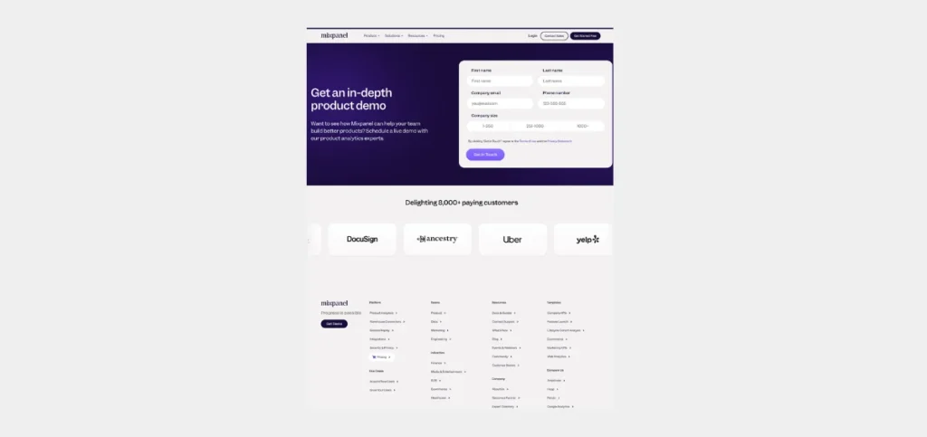
This landing page does not talk about the challenges the audience is facing. It focuses only on capturing leads and doesn’t connect with the audience. It also has a header section that supports navigation from the landing page. This is a big red flag on a landing page as an ideal landing page should stifle navigation like it is done on VWO and
Never build such landing pages. Every visitor wants to know whether you truly understand their problem or not and are offering a solution to it.
They want some kind of confirmation that the solution you built will address all their challenges and make their lives easy. Make sure your landing page contains all these key elements and assures the visitors a proper solution.
How to Improve the Landing Page Experience?
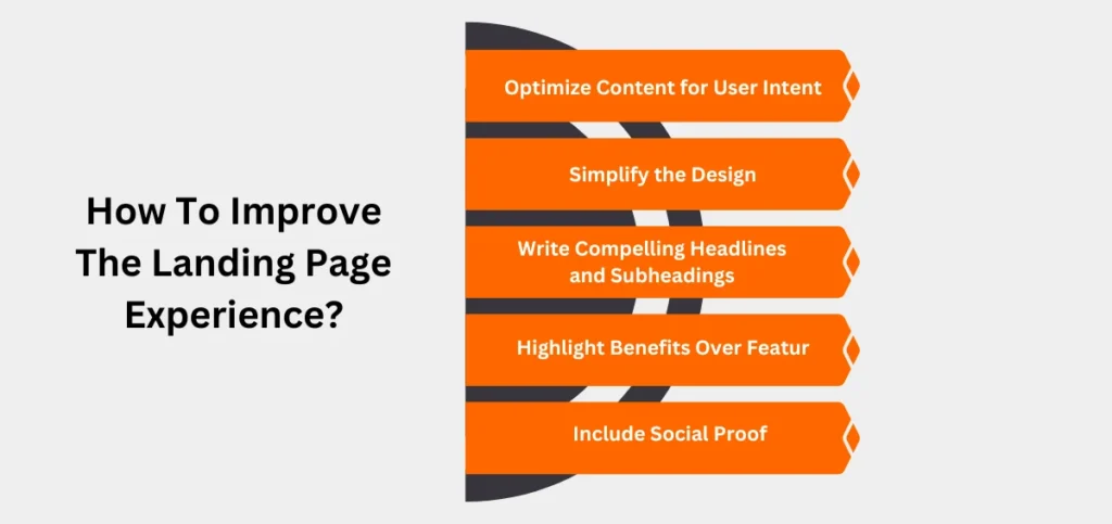
Your landing page should balance design, content, and user experience to increase conversions. Below are some actionable ways to improve its experience.
Optimize Content for User Intent
Coming up with a great landing page starts with understanding your audience and their pain points. Align the headline and content with their search intent. For example, if a user searches for “Google Ads Landing Pages,” your headline could be: “Boost Your ROI with High-Converting Google Ads Landing Pages.”
Simplify the Design
Cluttered designs distract visitors. Use minimalistic layouts with ample whitespace to keep the focus on key elements, like your offer and call-to-action (CTA). Ensure consistency in fonts, colors, and styles to establish professionalism.
Write Compelling Headlines and Subheadings
Your headline should grab attention immediately and convey the unique value proposition (UVP). Follow it with a subheading that elaborates on the benefits. For instance:
- Headline: “Turn Clicks into Customers with Our Landing Page Builder.”
- Subheading: “Easily create pages optimized for conversions in minutes.”
Highlight Benefits Over Features
Focus on how the product or service solves the visitor’s problem. Use bullet points to list benefits concisely, such as:
- Increase your conversions by 50%.
- Reduce your ad spend with targeted campaigns.
- Optimize every step of the user journey with analytics insights.
Include Social Proof
Build trust by showcasing testimonials, reviews, case studies, or client logos. For example: “Using this tool, we increased our sales by 35% within the first month!” – John D., Marketing Manager.
Adding measurable results makes the social proof even more convincing.
Note: Read All Facebook Marketing Blogs Here.
Benefits of Using a Landing Page for Google Ads
1. Ensures Content-Target Group (TG) Alignment
Your business can cater to various industries and personas. But you didn’t spend hours to finalize the target group (TG) for nothing.
You don’t want everyone on your landing page, but only the persona you’ve identified. Therefore, you design every detail on the landing page to focus on communicating and aligning with the TG.
2. Stifles Navigation
Since an ideal landing page doesn’t provide any scope for links to be present on it, the visitor has to take action or quit the page. You’re limiting their choices so it is easy for them to choose. The problem with enabling navigation on a landing page is it defies the very purpose of running an ad campaign.
3. Ensures Reliable Tracking
Use all the necessary tracking tools to collect important metrics such as bounce rate, average time on page (ATP), average session duration, engaged session per user, and more.
In addition, you can watch session replays, heatmaps, and user behavior from behavior analytics tools. All these metrics provide insights to fine-tune the landing page for higher conversion rates.
4. Drives Visitor Action
The landing page copies are written such that they address the prospect’s challenges, handle possible objections, provide a solution to visitors’ pain points, and direct them to take action.
All of this without any distractions. Along with content, placing relevant images for the content makes the landing page more comprehensive and adds to aesthetics too.
5. Helps Conduct A/B Tests
You can have multiple variants of a landing page with the same messaging by making some changes to the design elements. An example could be testing out two different lead generation forms with one having three fields and the other five, and inferring which works better for your audience.
The possibilities are endless with A/B tests as you can replace the form by embedding a chatbot for lead generation. You can also test CTA buttons in terms of design and content. You can try outcome-based buttons over action-based buttons or play around with the shapes and colors of the buttons.
Must Read: A/B Testing in Google Analytics 4
Final Thoughts
Cracking a phenomenal strategy for Google Ads fails if your landing page doesn’t align with your audience. The Google Ads landing page is the ultimate component of your ad strategy, and it talks and sells.
Use tools such as heatmaps, A/B testing, and analytics trackers to help you optimize the landing pages and make them more conversion-friendly. Also, minimize distraction by isolating the Google Ads landing page from the rest of the website—strictly no navigation. You can also use the “robots.txt” file to prevent Google from crawling the landing page.
Design concise, mobile-first landing pages that resonate with your target audience. Still wondering where to begin? We help businesses like yours with our Google Ads Management Services to help you get better ROI from Google Ads campaigns. Feel free to reach out to us for further insights.

